“[W]hen painting Ascension, Edwards found that the painting resolved itself rather too quickly. It was looking too sweet, too illustrative:’I was suspicious of how quickly it had come into being, so I knew I had to disrupt it.’ He threw handfuls of ash at the painting, then picked up a bucket of sludgy turps and threw it over the Rococo cloud forms, letting the deluge fall down the canvas into the field and land area. This disrupted a too easily read picture and created an atmosphere of mystery, of half remembered emotional weather.” (120)
Painting Abstract Landscapes (by Gareth Edwards and Kate Reeve Edwards, 2022) immerses the reader in an aesthetic world that emphasizes the misty, romantic, feelings laden world of the intuitive, the subconscious, in coastal mist, and the world as viewed through feeling and memory. It is grounded in practical, technical opinions on paints, gesso, solvents, and grounds, all at the service of immersing the viewer in that feelings-informed view. Its intended audience is intermediate to advanced painters who want to learn this specific genre. There’s still a lot of good material for a beginner painter, but they would probably be better off taking a traditional landscape painting class in oils first, even if only a weekend workshop.
A key perspective is that paintings are always both an object and a window, and the painter should focus on the physicality and surface details of the piece, and also remember to suggest some land, water, and air. Also that “the truth is on the paper,” and people are better off looking at a painting than talking about it. Still, this is a written book, not just a book of prints, so they do take positions about meaning, which turns out to be rooted in the Romantic era. This is a bit dangerous, both the painting and the writing have a difficult path to thread, between offputting pretentiousness, and naive illustration.
I want to paint, and sometimes like painting, but don’t have a style or direction worked out yet, and have been looking around for one. I like landscape painting, but don’t like feeling like I’m competing with or replicating photography. I didn’t care for abstraction coming into reading this book, neither looking at nor painting it. The closest I had come was making some abstract encaustic pieces, because of the beautiful way the pigments melt across the wax, but even there, I wanted it to be somewhere. I would carve out little cliff dwellings and call it an abstract version of Mesa Verde. At an abstract oil and cold wax painting workshop I went to [1], I accidentally painted what looked like cliffs overlooking a reservoir, and clouds. This book hit the place between abstract and observational landscapes even more closely than I had hoped, while also bringing in poems, stories, and psychology that are in the same tradition I’m familiar with, but with a more Romantic, Feelings focused take.
The book is about equal parts prints of Gareth Edwards’ paintings, aesthetic opinions from him and his daughter, Kate Reeve-Edwards, and technical instruction about how the reader can themselves create abstract landscapes. Gareth Edwards is a professional artist working in the United Kingdom, and the paintings and processes are his. Kate Reeve-Edwards is a literary analyst, and many of the words are hers, but it’s not clear which. The bulk of the book is written in third person, and is full of poetic quotes and allusions to various art historical figures, which are probably written by Kate, who refers to Gareth as Edwards and GE interchangeably, as I shall also do here. There’s a quote attributed to Picasso, “When art critics get together they talk about Form and Structure and Meaning. When artists get together they talk about where you can buy cheap turpentine." Kate writes a lot about Form, Structure, and her father’s reluctance to commit to any specific Meaning. Gareth has a lot to say about what to do with the turpentine once you have it. There are several prints of the artwork of Joseph Mallord William Turner, one of the first painters to go in more abstract directions with his landscapes, as can be seen, for instance, in Wind, Steam, and Speed (1844)
Overlook along the Million Dollar Highway, by the author. 9.5”x9”, Oil and cold wax on paper, 2026
Because of the way the concrete painting advice is bolted together with literary allusions, the most practical content is not the most interesting to write about. The best parts, as a painter, are starting from a randomized, abstract expressionist, “poured” background, painting on a square or nearly square support, buying desaturated tubes of paint instead of always starting from primaries, specific compositional devices, and certain surface techniques. The most interesting thing to think about, on the other hand, is poetic moods, emotional weathers, an artist’s knapsack of themes that recurs throughout their work, about the feeling of color, desire and a sense of need in selecting colors, and the feeling that a painting shouldn’t be too neat and pretty, should be a bit uncertain and complicated, but still look like someplace.
There are several points in the book where there’s missing context, and although it is in general a good art book, it could become an excellent written book as well if it would boldly dip into that context and actually explain it. There are people they’re pushing against, but they don’t want to name them, and I feel some kind of drama in the background: can a painter get cancelled for explaining the controversy around “the truth is on the paper,” and not wanting to have to assign an intellectual meaning to the piece? GE wants to make art that’s beautiful and isn’t propaganda, which people will want in their living spaces. Some artists stop there and don’t go into dangerous art world issues at all, instead talking about the time they went for a walk in the woods near their house and saw a pheasant, and how happy they are to have always lived near the woods [2]. I appreciate at least alluding to some of the issues of modern curation.
Abstract Landscapes is strongest when presenting GE’s paintings, which are nicely printed and bound, and fill about half of the book’s space. Other strengths include density of thought to match the visual density, clear and useful compositional devices, and specificity in describing the reasoning behind decisions of what tools to use, what paint colors, various pigments, turpentine, linseed oil, and other concrete considerations. It is at its weakest when it tries to talk its own methods up as deeply poetic and laden with feeling, while denigrating those who focus more on things like cities, perspective, and color theory. I also prefer looking at paintings by Joseph Mallord William Turner to those by Gerard Houckgeest, but I don’t think that this is because Turner is poetically more true to the experience of looking or some such thing. Many of us have forgotten how to properly admire great spaces, whereas we’re still somewhat able to admire great vistas. This doesn’t necessarily speak well of us.
Abstract Landscapes
What does it mean to paint abstract landscapes, as opposed to landscapes more generally?
Initially it looks like it’s about painting fictional places, from memory and imagination, rather than from reference photos or by making studies on site, and that they’re a bit vague and atmospheric, rather than detailed, without animals or human habitations. But it extends into the method as well, which is inspired by abstract expressionism.
Traditional landscape artists start with the idea of a place, and then they paint that, looking at the forms and shapes and colors of that place, at that time. It can be impressionist, with bright colors juxtaposed next to each other and strong, changing lights. It could be illustrative, perhaps from a fictional story. Wherever it is, the unfolding of the painting process is driven by the imagination or memory or references of that place. If someone is painting a landscape of Rohan, they’ll imagine how the mountains are described, perhaps there will be horses, and they will look at horses or pictures of horses, they will think of what plants might grow there, and look at them to get the details right. They do also think about color schemes, value contrast, gestural marks, and other formal elements, but these are in service to depicting the place.
The Abstract Landscape painter, instead, begins in color, tone, and the physical act of painting. Squeezing paint and blending it, dissolving and pouring it, thinking about color and tonal relationships, before it has become a place. Then, after the painter has “completed the pour,” they should look at it, imagine it as a landscape, and paint a landscape within the space, led by the accidental relationships they see in the pour. Oil paint, especially, is very opaque, and they might entirely cover up the initial pour, but their decisions are guided by what they saw there initially. Perhaps later they might name the place they see in it, like A Winter’s Field, Somewhere in North Europe (Gareth Edwards, 2024).
Why might an artist want to work from abstraction, rather than from reference photos or studies from life? Mostly because they enjoy the process more. Gareth Edwards likes it a lot, calling it “life-affirming and life enhancing,” with “thrilling and fulfilling results.” (12) It’s also strong in certain areas that are tricky to photograph well, such as distant vistas softened with atmospheric perspective, fog, and mist. Edwards’ paintings often take a viewpoint as though standing high on an overlook, and other abstract landscape painters like to depict weather across an open plain or sea.
Beginning in abstraction solves the problem of deciding what to paint, the way writers often begin with a stream of consciousness pre-writing, which they might end up removing from the finished draft, simply to get their mind heading towards their goal. To have something rather than nothing. It might lead to more interesting places than simply starting from the conclusion, or by placing a horizon a third of the way up, a tree a third of the way over, a building in linear perspective, and so on. Like surrealism, it can reflect the artist’s psyche more fluidly, which can be interesting for the artist, and result in surprising relationships they might not have otherwise considered.
Pure abstraction can easily fall into being much more interesting to the artist than to the viewer. While there are some viewers who are excited to see color relationships and marks placed with intention, many more want it to look like something, they want to be able to imagine where or what it might be. In Edwards’ language, the painting is both an object and a window, and the viewer feels a greater connection when the artist gives them a window into something that’s relatable as place, and names it as a place, for instance, After the Rain, at the Edge of Town (2022).
Psychogeography
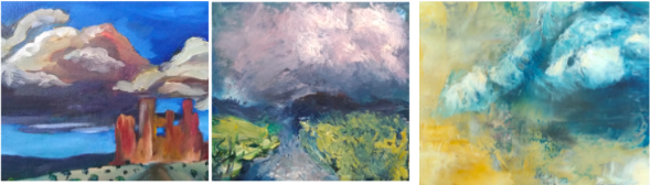
GE isn’t painting any specific place, necessarily, but he does tend to end up with a cool, misty, Northern European atmosphere most of the time. Some of his paintings are inspired by visiting the Mediterranean, such as Tuscan Sunrise, but that’s still a very soft mist. How well does that translate to other climates? Of the handful of Abstract Landscape artists I’ve found and whose work I follow, they are mostly working near the ocean. Serena Barton, a Portland based artist, visited Utah and New Mexico, where she made pieces like “Las Ruinas”, which is much more roughly textured than some of her dreamier, more subconscious focused pieces, and that series is especially very orange. Abstract paintings I’ve seen in the Southwest often feel like cliff faces, fractured and full of very warm, saturated color. Dreamland, by Santa Fe artist Cheryl Kelley feels like a very cool, wet, pondy kind of abstract landscape, farther on the abstract side of things. Ultimately, GE’s approach should work for any place that offers open vistas, where the horizon becomes blurred by air, dust, and vapor. In America, the majority of regions offer views like that, and most people should have seen them. Looking out over the Great Lakes, the Great Plains, the Great Desert, or down from the Rocky Mountains, all give views that are tricky to photograph well, and are good candidates for depicting through sfumato and atmospheric perspective. If a painter wants to depict a specific landmark, like the arches of Utah, or the saguaros of Arizona, they might be better off taking a different approach, but every region has views that can be hinted at through these techniques. And of course, they are not constrained; if an artist wants, they can start their painting as an abstract landscape, and then paint cactus on it.
One big regional difference is in the colors. Edwards loves desaturated hues and rarely paints the sky blue, whereas painters of the Southwest love blue and orange, showing the dazzling bright skies and the distinctive orange clay. They should paint what feels right, what represents their own inner themes and preoccupations, and perhaps they will want to sell some paintings. If they feel the blue and orange, if it offers light and dark tones, and if people love it and find it beautiful, then that is what they should paint.
Of all the literary references, I understand Jung the best, and even before reading this book, the act of painting abstract landscapes, and workshops in abstract paintings that turned into landscapes felt very Jungian. So I’ll take two Jungian ideas that make some sense to me: psychogeographical archetypes and symbolism, and cognitive functions.
All that water and mist might be about the unconscious or the subconscious. These vague, wet, misty images seem of more interest to those in midlife and beyond. A child is happy painting the ground green and the sky blue, even if on that day the sky is grey and the ground is tan, because archetypically, a green place with a blue sky is a good place, a good place for people to be. A young adult who wants to paint landscapes is happy painting them literally, what they actually see. They like to see what the shapes and colors and shadows are like. At midlife someone interested in paintings and landscapes has seen too many of them, and starts to worry that they’re “too sweet, too illustrative.” Edwards talks about working as an abstract landscape painter for 25 years. He was born in 1960 and writing in 2020, so perhaps he was 35 when he began working in abstract landscapes, specifically, after not caring much for observational painting. The adults over 30 I’ve shown his work to all find pieces they like a lot. The children basically ignore it, and don’t see anything in it. Those vague, misty landscapes resonate with the psychogeographies of midlife and individuation, and perhaps also the experience of having seen too many vistas, while still also wanting to stop and look at another vista, and perhaps paint it afterwards.
There’s been an entire system built up around Jung’s cognitive functions, and the ones that are important in this context are Thinking, Feeling, and Intuition.
Contemporary abstract painting is taught, first and foremost, as an Intuitive process, where the artist should feel out what he or she likes and wants, moment by moment, bringing out things they don’t know consciously, but recognize when they see them emerge from the subconscious. Serena Barton, in Wabi-Sabi Painting with Cold Wax (2015), talks about building up, scraping back, adding texture marks from kitchen implements, scraping on, and fighting with each painting. She has become more patient over time, knowing that it will be psychologically fraught, like having a tense conversation with her painting. She doesn’t know what a painting will be like until she feels it to be finished. The artists Edwards interviews for his last chapter, How to Finish a Painting, all have similarly unpredictable, intuitive painting styles. Richard Cook, especially, talks about working in an almost frenzied way, “at break-neck speed, hurtling towards an inevitable instinctive ‘finish’ point.” (146) I resonate with this intuitive painting style, and was never able to properly plan out paintings or drawings in advance. I would have to simply show up, switch from writing and thinking in words, to applying ink or paint to a surface, and see what would happen. Most of the time I liked what happened, but would get stuck in the choosing phase, and simply sit around writing down lists of things that I could paint in the future, but then didn’t. I did best at workshops, where either someone else chose what we were going to paint and set it there in front of us, or I was teaching, and forced to choose quickly, intuitively, because there were students entering the room, and we needed something that moment. The abstract expressionist pour is a good tool for me, since it gets around committing to an image upfront. For the same reason, I prefer oil paints to watercolors, because it is very opaque and easy to simply paint over it if I don’t like it.
One stark difference between Edwards and I is that his language is very Introverted Feeling heavy, in the Jungian sense, and mine leans strongly towards Introverted Thinking. So where they will suggestively reference Keats and Byron, the vast unplumbable depths of the Sea and the Collective Unconscious. “[I]t is never simply a case of painting something observed. You are painting something felt. It is a subconscious understanding.”(134) But, no, what if my feelings about aesthetic things are very light and fleeting, and I can scare them away just by looking at them? I could think all day long about John Beebe’s 8 function type model, or the chemical composition of paint, or the potential uses of AI image generation, but I cannot stay in the Feelings space for a minute, it’s unconscious for me, and invisible. John Beebe says something like that if my most preferred function is Introverted Thinking, then my very lowest, least conscious (“demon”) function is Introverted Feeling. I don’t have a strong opinion on the extent to which Beebe’s model accurately reflects reality, but either a bunch of otherwise good artists and poets are just spouting gibberish, or I have a blind spot.
Is this a major impediment? Should I give up on Abstract Landscape Painting? I tried taking a poetry class once, where the teacher told us to just try writing some words down and see if they became a poem, and I did in fact give up, and produced no poems. At least here it’s not just formless and void, I can always imagine a landscape I’ve visited, and nobody’s likely to know that I didn’t have dense, poetic Feelings about it. Or maybe they can tell? Well, it’s worth trying, anyway. Perhaps someone with Feeling preferences can tell me if my painting is emoting sometime, and I’ll gain insight into my Unconscious.
Methods and Elements
An artist should begin by collecting a "knapsack" of feeling themes that appeal to them, and keep those in mind as they begin a painting, though without committing to any one too soon. “As an example, some of the themes that Edwards accesses through Abstract Landscape Painting are a sense of yearning, a journey towards the light, dark psychological geographies, and emotional weathers.”(36)
Is it pretentious nonsense? I like GE’s paintings, so I’ll try to entertain the possibility that it’s not. Still, it’s not immediately helpful to me, I do not feel any such themes emerge. I considered the question a bit. I like little signs of habitation, surrounded by vast wilderness. Abandoned cliff dwellings, a tiny stone church sitting on top of an enormous mountain, a little apple orchard surrounded by the Utah badlands, the actual palm springs off in the desert by the city of Palm Springs.
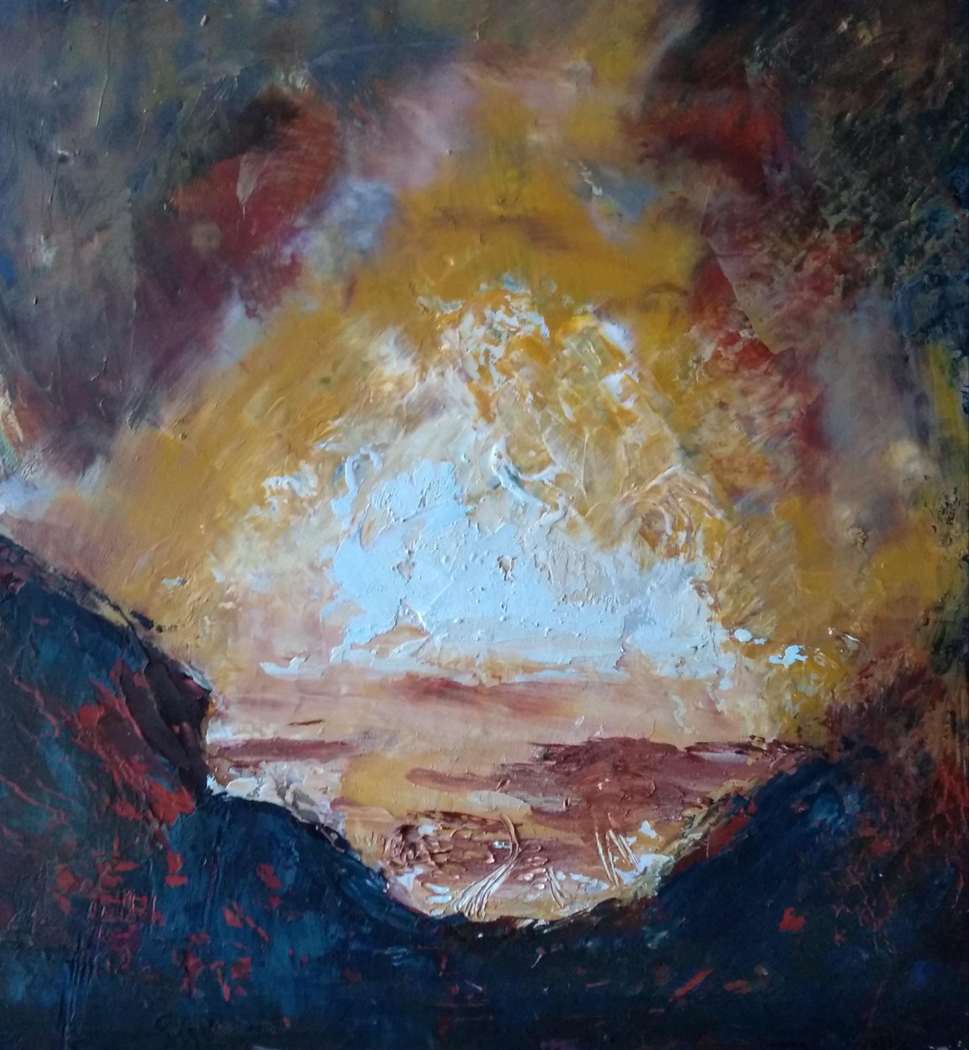
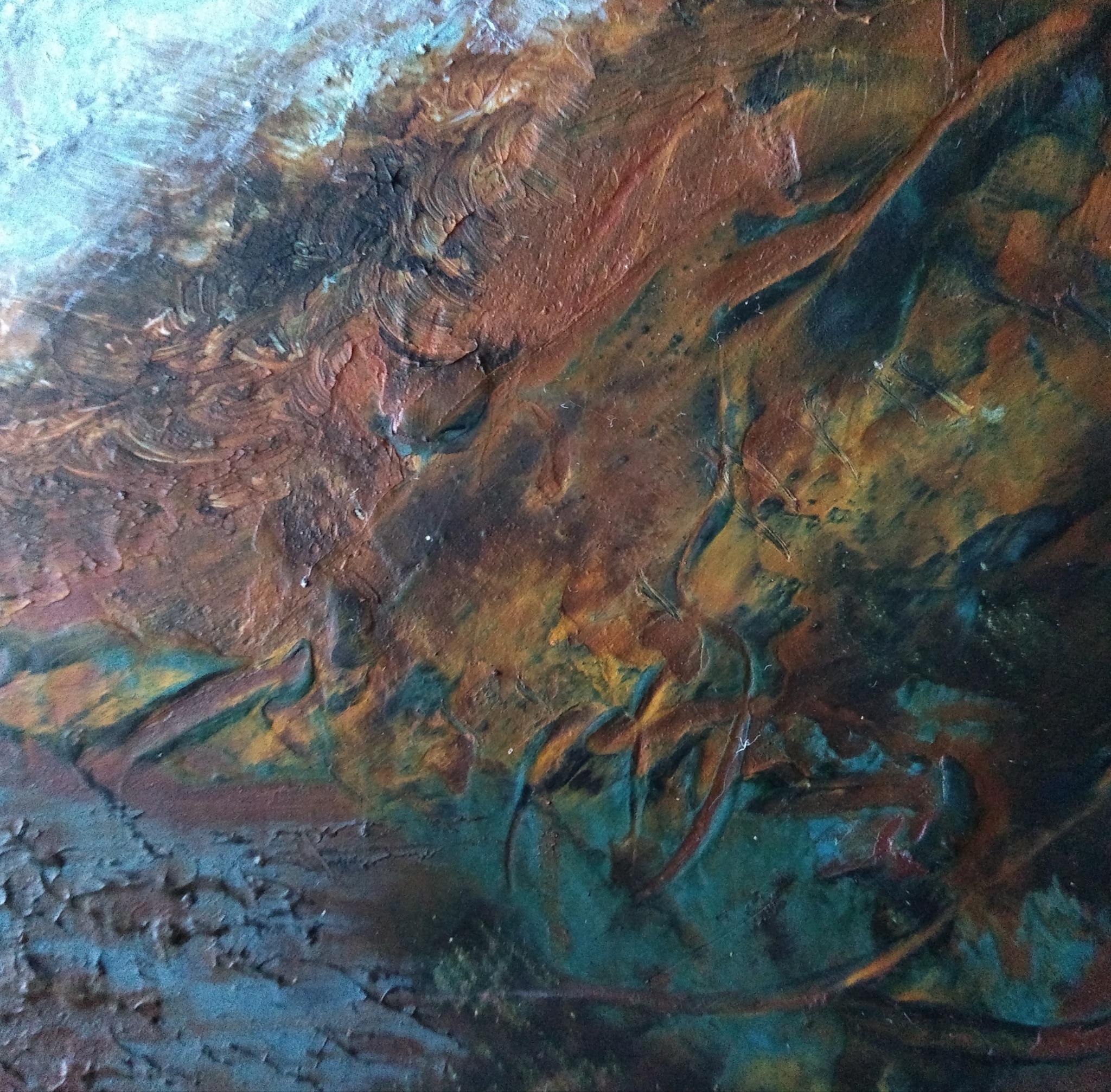
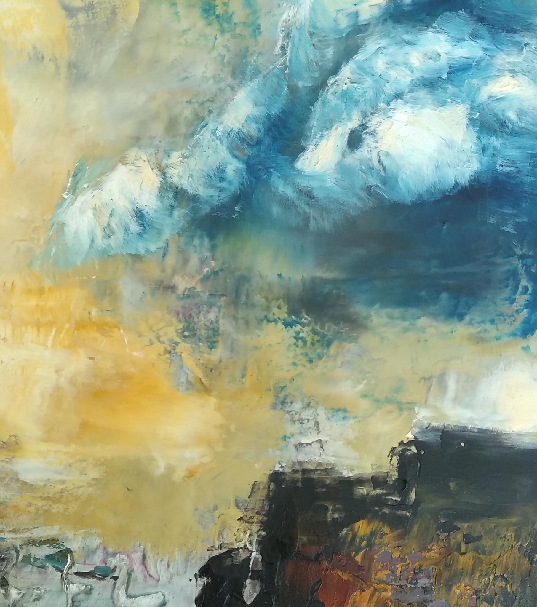
What then? Should I paint that? What should I paint it on? Like most artists, GE has a lot of opinions about choosing a ground. He does not like pre-prepared canvases and panels, and instead likes to make them himself and get them custom cut, with slightly off square dimensions, between the wide ratio of a landscape painter, and an abstract square. Edwards likes ratios like 55 x 57 cm or 90 x 100 cm. Every day for a week I thought about going to the hardware store and having such a panel cut, and every day I didn’t do it, until finally I got some 9”x12” watercolor paper out of the closet, cut it down to 9”x9.5”, taped it to some boards, and gessoed it, in keeping with Edwards’ recommendation of a watered down layer, two layers “neat,” sand it lightly, and another watered down layer. I followed his suggestion to gesso ten of them in advance, since I had the space and supplies at the time for that not to be too onerous.
GE likes to dissolve oil paint in turpentine (turps), pour it over his prepared ground, smear paint directly from the tube onto the piece, and wipe or drip it away. Alternately, someone could start by applying the paint from the tube, then blend it, perhaps with their fingers, to begin a section of air, and apply ground with a palette knife. I tried dissolving water mixable oils in water, and pouring them, finger painting, and mixing cold wax medium into the paints and somewhat randomly pulling it about with a silicone wedge. I prefer the oil and cold wax approach [4]. It has some of the melted wax look of encaustic, some of the unpredictability of turps, and is easier to use at the dining room table, when I have to set up, paint, and clean up all within two hours or so.
Three Initial layers: a fingerpainting, a pour, and scraped with wax.
After the pour, the next phase is to look at the painting for a while, and consider where it might go. It should have, among other things, a composition that will help the viewer read the image, and Edwards offers suggestions for several possibilities, including the Horizon, the Golden Section, the X, the Inverted Pyramid, or perhaps the Double Pyramid, the Stepped Diagonal, and the Diamond. The horizon is mostly just a strong horizon line, with sky above and ground below. This is powerful and frequently used. The Golden Section is also classic, pleasing, and can be hinted at, as in The Rising and Falling, where the large, more softly graduated left section is balanced by the tall thin dark section on the right, and the small, calmer light violet square on the top right. The X composition suggests a bit of linear perspective, which is good for leading the eye back in space. The Pyramids are interesting. Portraits tend to be pyramidal, with the smaller head and broader shoulders, and landscapes usually aren’t, though there are painters who will depict a portrait of a cloud, for instance, and it will become very dramatic and detailed. The Inverted Pyramid in landscape can suggest a valley, with deeper tones on the sides, and lighter tones in the center, and it can be nice to overlap a light pyramidal cloud in the center, so that the light section is in a kind of central triangle, making up a valley of light. These and other compositional devices can be overlaid, especially through the subtle forms of the clouds, as in Turner’s Keelmen Heaving in Coals by Moonlight (1835), where there’s an X composition, showing perspective and depth with the ships, and also a pyramidal cloud formation on the center left. I liked this section. Some art teachers forget to teach about composition at all, and others say things that I didn’t understand and couldn't use. The main compositional device I learned and understood previously was “rule of thirds,” where your main horizontal and vertical lines are along thirds lines of the picture plane. So if there were a tree standing in a field, the horizon line for the field might be a third of the way up, and the tree might be two thirds to the right. This is very common, and fine, but Edwards doesn’t mention it until Air and Water, towards the end of the book, and it’s nice to have other options that aren’t too hard to pull off.
I looked at my paintings, and applied some compositions to them, too aggressively at times.
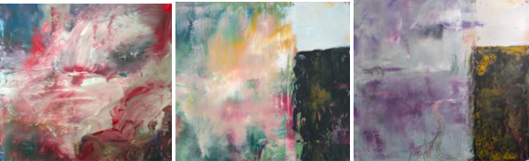
Three layers of Overlook along the Million Dollar Highway
It started out with a stepped diagonal and horizontal through accident, and I imposed the Golden Section on it because it looked interesting, and I didn’t want to have to wait around for it to emerge spontaneously from my subconscious. The first layer looks interesting as well, and one of the questions I have for this stage is about retaining components of the initial pour in the final painting, since oil paint is very opaque, and it’s easy to just cover it up altogether, even though it does contain interesting drips, unexpected blends, and textures from the dissolved pigments, which like to clot and drip.
Edwards talks about three historically important ways of handling tone: Chiaroscuro, Tenebrism, and Sfumato. Chiaroscuro involves a careful movement of tones to imply form, and is most associated with the Renaissance masters. Tenebrism is the intense juxtaposition of lights and darks, perhaps with a few strongly lit faces and collars in a sea of black, and is associated with Baroque painters like Caravaggio. Sfumato is about misty, gradually blended tones, and has also been used since the Renaissance. It is especially a technique of slow drying paints like oils, and almost impossible in some mediums, like tempera, which dries too quickly.
The reader is encouraged to think about all of these, and use them when they want tonal movement, drama, or a misty, mysterious feeling, all of which work well in abstract landscapes. Sfumato is of particular interest in this genre, one of the effects that initially drew me in, and got me to read this book. Edwards likes using his fingers for sfumato, and other artists like using makeup wedges, which I used in some of my paintings here.
Color is important enough in painting that every writer and teacher of art has to address it in some way, but are often self conscious about what their students will or won’t already know. There’s a strong element of that, and also some useful information. “Colour is fickle. Like smoke, refuses a stationary fixedness. It is eternally ephemeral. Any colour which seems understandable enough when it slips out of the tube, as soon as it is confronted with another hue or a grey, or positioned in a specific place on the canvas, darts flickers, flashes like a startled minnow, metamorphosing into something fascinatingly altered. (67)” There are several paintings with red/green complementary color schemes, and some monochromatic paintings in blue, red, and yellow. There’s an exercise of making six color schemes in quick succession by drawing a square on a sheet of paper, dividing it into rough golden section segments, and filling them with light, medium, and dark colors in line with various color schemes, whatever you find pleasing. Complements, harmonies, monochromatic, or triadic, by applying the paint directly to the surface from the tube, and scraping it over the section with the palette knife.
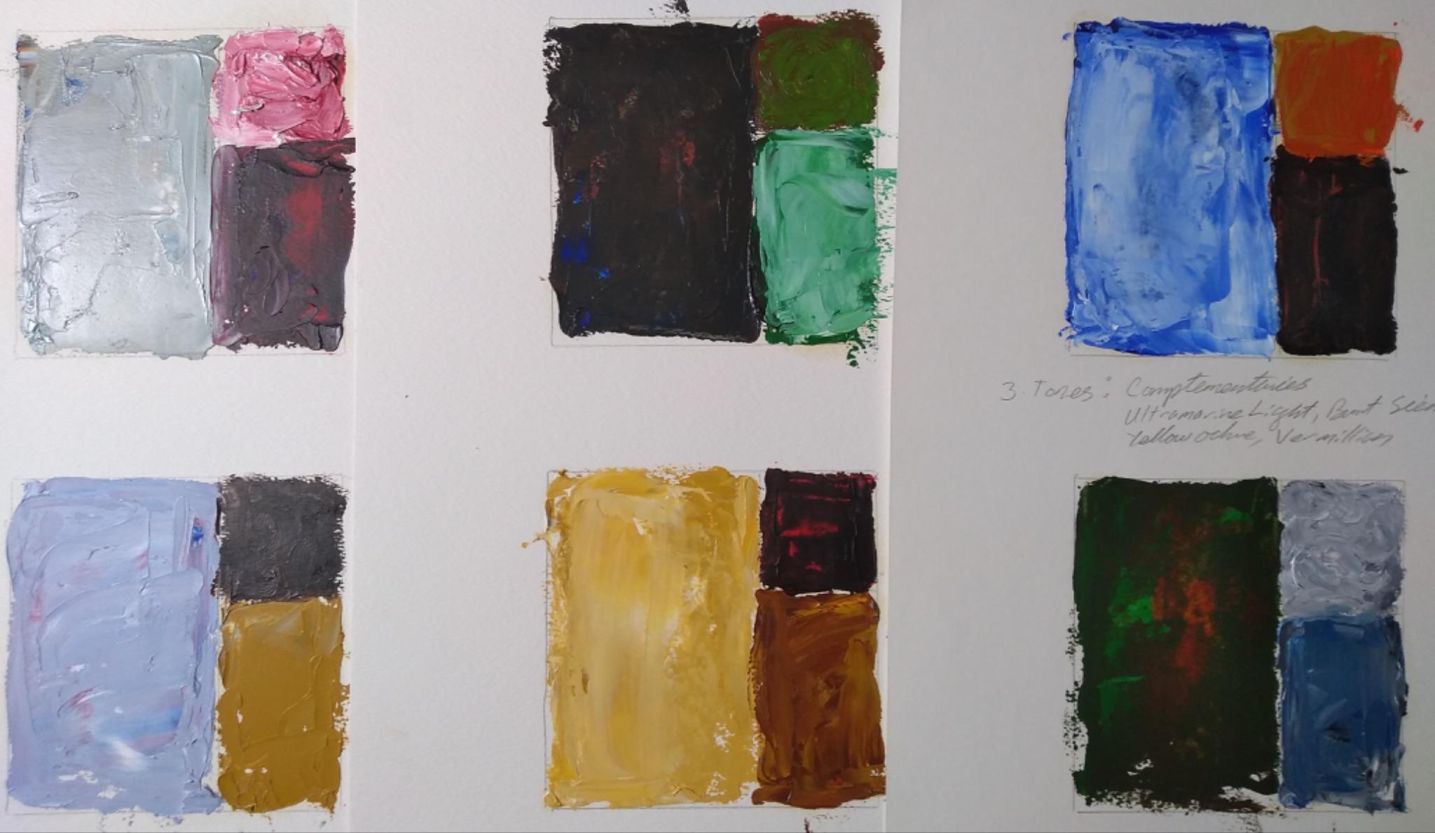
It’s not a bad exercise, I especially like the golden ratio set up, but I did not resonate with the application of paint directly from the tube, nor the command to find the third color by instinct, feeling, and desire. This is partly because Edwards has curated his paints, so as to already have desaturated hues straight from the tube, whereas if I want, say, a green umber, I have to apply both green (I have phthalo green, an extremely strong pigment), and umber. Then I just have to accept whatever the ratio ends up being. The partially blended colors look rather nice, but don’t make up for the lack of control. I tried it a second time, and still didn’t love it. My paintings were so small, and oil paints so opaque, I decided I might be better off just covering an actual painting paper with my colors, and covering them up again if I didn’t like them.
Edwards has a distaste for color mixing on a palette that I don’t share, like he has bad memories of a strict art instructor who only let him mix colors from nature on a glass palette with the bottom painted white, and made him scrape it clean each day. He considers it a danger of plein air painting, especially, to have to spend all of one’s time fussing over color mixtures to find some exact hue from the landscape, and he does not like it at all.
There’s a funny aside about how contemporary curators don’t like green, because it reminds them too much of the “chocolate box” landscapes, and of Monet. Not that there’s anything wrong with Monet. Edwards encourages the reader to give green a chance, especially Perylene, Teravery, Olive, and Sap green, but not chrome green, which is “crude”, “harsh”, and “metallic” (87). “Nicholas Serota, the director of Tate between 1988 - 2017, felt like he had to defend Cy Twombly’s evocative use of dark, light, and medium green because so many people associated it with pastoral landscape and Impressionism.” (85) I disagree that it’s about impressionism, rather than archetypal desire for landscapes with growing plants that sustain life, but either way, I’m pleased that Edwards is encouraging painters not to write it off just because some curators who have seen too many paintings are tired of it.
This chapter starts by acknowledging that perspective featuring one or several vanishing points is often used to convey a sense of distance. They seem to have complicated feelings about that, and talk about how our eyes and heads are always moving, and that using vanishing points is pure artifice, as much as when Picasso shows multiple views of a single object at the same time in cubism. Not that Edwards never uses vanishing points at all, and it shows an image somewhat like the one here, suggesting plowed fields full of small plant marks. Still, they’re uncomfortable suggesting that painters should rely on it, or think it more true or correct, and talk about Egyptian frescoes and Chinese ink paintings, which immerse the viewer and suggest space without using vanishing points. There is no description of how to use linear perspective, it is assumed the reader probably knows it already, or could easily look it up. Then the book continues, in a new subsection, “It is atmospheric perspective, instead of a draconian use of linear perspective, which Edwards encourages the Abstract Landscape Painter to employ. Atmospheric perspective coaxes the viewer through the picture plane into a distant space. They are transported transcendentally to a poetic realm, drawn through the layered, elegant surface of tactility into something more internal. The viewer penetrates their own surface, accesses their own depths, quietly examining the fragments of their own experience.” (90)
Like much of the writing in this book, this seems to be situated within a conversation I’m not privy to, among artists and art instructors, and across time. It would be interesting to know more about that! I feel like they’re holding back something that they feel to be embarrassing, or sensitive in some way. I personally like all the vague, hazy, atmospheric perspective-laden pieces, or I would have chosen a different book. I want a better account of the crisp linear edges people vs the hazy dreamy people. Perhaps historical? Simply asserting that those viewing the atmospheric paintings are “transported transcendentally to a poetic realm” is cheating! It is wrong. It is untrue. Or perhaps it’s true of some people, who are already convinced. Proponents of Draw a Box are justified in simply laughing at this. It’s not that M.C. Escher was prosaic, but simply that he was drawing witty poetry, like Lewis Carrol.
The book continues: it might be a good idea to put a little path, or a few little trees or posts into the atmosphere. Some of the posts or trees can be bigger than others, that doesn’t destroy the atmosphere or the emotion. There’s a little tutorial, “Creating Space by Chance” (95), about applying some paint directly from the tube onto the surface, and smudging this around with your fingers, until it feels a bit like atmosphere, then applying a thicker, more textural layer to the bottom with palette knives, to suggest ground. There are some photos of GE working, and it looks like he is in fact smudging oil paints with his fingertips, here and elsewhere. It doesn’t talk about using large amounts of degreasing soaps afterwards, but I suppose he must? He says he’s been painting this way for over 25 years, so I suppose it must not have hurt his hands to do it that way, but I still don’t like it. I tried it once, and otherwise have been wearing gloves.
Returning to the demonstration, GE has blended the sky with his fingers, and added texture to the bottom with his knife, including a serrated palette knife. “However, by doing this, the bottom can become too busy, with too many accidental areas of contrast or energetic marks. A great way to re-introduce accidental space is to re-pour turps on top of these foregrounded areas. This instantly opens up the foreground and can result in more happy accidents.” I appreciate that this is a concrete suggestion, but I am not feeling like things are too easy at this moment, so I didn’t try it out yet. I would really have preferred for him to have taught me how to paint these pretty, fluffy clouds, because I haven’t figured out how to make them yet, and will have to search elsewhere for guidance.
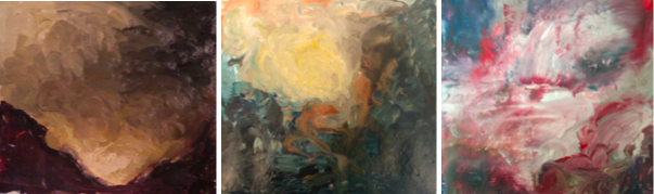
Left: Detail of a painting made using a reference photo, from a class that took a somewhat structured approach to oil painted clouds.
Middle: Abstract landscape using some attempt at finger painting and intuition to achieve puffy clouds.
Right: cloud painted from memory, with a disposable makeup wedge.
It seems like the structured clouds are better, and, especially, the structured clouds are more like the clouds I admire in reality, but that the far distance is better in the abstract landscape. In the structured piece, I surrounded the clouds with large areas of bright blue sky, which is true to reality, but detracts from it as a painting. Gareth Edwards almost never fills the edges of his sky with bright blue, making it moodier and more atmospheric, and perhaps I do like that better. The third cloud is an attempt to combine the technique, painting a puffy cloud on top of an abstract sky. I tentatively like it, but might glaze the blue in the cloud with purple, the complement of yellow.
Looking at the paintings above, perhaps the memory was of the cloud on the right of the structured sky painting. While other artists talk about going out and making sketches or taking reference photos, Edwards prefers to find perfect Rococo clouds in his memory and implement them by intuition. But first a person needs to stock their memories. Edwards did that by getting an art degree, where he was required to learn formal drawing and painting techniques, some of which he later rejected. To continue improving, I would have to sometimes paint from reality, in order to store up things like clouds in my subconscious for later retrieval.
The Air, Water, and Land chapters were an interesting pivot, from formal elements of art, to physical elements. The book doesn’t focus on all the formal elements, only those of importance in this specific genre, and so too this section has three of the four classical elements, in accordance with GE’s misty, cool aesthetic. Turner was bolder, with pieces like “The Burning of the Houses of Lords and Commons, 16 October 1834,” containing plenty of fire, and also signs of people, which Edwards’ paintings lack. In the chapter on Land, there’s some information on using raw earth pigments, such as yellow ochre and raw umber, and a tutorial about mixing oil paint from pigment. They encourage readers to trust the viewer, they will see a landscape at the slightest suggestion, and like to fill things in from their own memory and feelings.
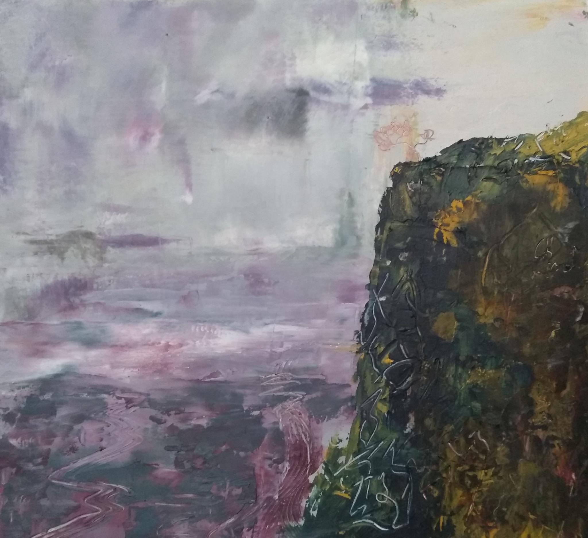
Descent into a Phoenix Exurb, by the author. 9”x9.5”, Oil and cold wax on paper, 2026
The final chapter has examples of other artists' work, their views of how to finish a painting, and how they know when a painting is done. It amounts to: you have to decide for yourself. The other painters are interesting, and I especially liked Andrew Hardwick, who said that if his art doesn’t sell and returns to him, he paints over it rather than store it, since he has limited storage space.
The Subtext
We’ve attended too many classes, read too many books, seen too many Monets.
It's a bit hard to read all the text, rather than just looking at the pictures, they have clearly put a lot of effort into it, and it rewards reading with unexpected, interesting thoughts. It benefits from Kate’s work in adding literary and historical references and fleshing out some of the ideas, even in the face of Gareth’s insistence that we appreciate what is there, as object and window, and not look for Meaning outside our own impressions, feelings, and memories.
A big meta takeaway is that some people should probably take a break from reading and looking at paintings. They have become too cultured for their own good, and can no longer appreciate perspective, pretty landscapes in tourist shops, or the color green. One of their strengths is in presenting a partial insider’s view of this experience. They aren’t laughing at the curator of the Tate, they’re taking him seriously and respectfully, but also a landscape painter shouldn’t simply write off one of the most common colors in the landscape because it has been used a lot, or because it’s pretty.
There are a lot of hints about their emotional makeup that I find foreign, and I can’t tell to what extent I simply have a different experience of emotion, or they’re failing to communicate clearly. I like looking at and painting abstract landscape paintings. I find them beautiful, and interesting, and like when they are displayed. I would like it if I could afford a painting like those Gareth Edwards makes, and if there were more of them in public spaces. Perhaps I will keep working on them. But I do not understand what they mean by passages like “[Viewers] are transported transcendentally to a poetic realm, drawn through the layered, elegant surface of tactility into something more internal. The viewer penetrates their own surface, accesses their own depths, quietly examining the fragments of their own experience.” (90) I mostly do not understand what they are talking about in respect to emotional weathers and the feelings of poetry. I like poetry. For instance, The Lovesong of J Alfred Prufrock, by T.S. Eliot sounds almost perfect when read out loud. Plenty of poetry sounds wonderful, like music. And many of these paintings look very good as well. Is there something else to access there?
A person can paint and write poetry cleverly, like Lewis Carrol or M.C. Escher; grandly, like Gerard Houckgeest or Tchaikovsky; evocatively and romantically, like John Keats or Gareth Edwards. Whether or not a Thinker is missing out on some Feeling essence in the work, painting Abstract Landscapes, Jungian psychogeographies, and vistas full of atmospheric perspective can be a good practice. It’s easy to get all wound up in the thought space of people talking about assortative mating and TFR and hypergamy and other such things, and it’s good to step out into ancestral moorlands full of tragic love stories, fairies, and atmosphere overtaking everything, covering all human habitation in mystery.
Detail of Poetic Overlook, by the author. Oil and cold wax on paper, 2026
Conclusion: Beautiful, and Somewhat Useful
For its intended audience, I give it a 9/10. It’s densely packed with images and information. It is beautiful, and thoughtful. If you like Gareth Edwards’ art, and also like to paint yourself, this is a good book. It’s beautiful, has a lot of examples, suggestions on concrete techniques, and sophisticated prose. The viewpoint is strong. Abstract landscape, specifically, offers useful parameters, in contrast to fully abstract painting, or landscape painting from a reference photo.
I appreciate all the information Edwards presents about his painting method, and am especially interested in the order of operations: randomized start, find the composition, look at the elements of art, then refine the land, water, and air. I’ll likely continue to use that general frame for more paintings. I don’t like the almost but not square format. At 9”x9.5” I kept struggling to figure out which way was tall vs wide, and it hurt a bit to think about it. In the future I’m more likely to use an actual square orientation, vs portrait or landscape. If I’m still painting in another few years I’ll probably also be tired of standard sizes, and cut my own custom panels. I will likely continue referring back to it in the future, and change my painting method as a result of reading it.
While I can’t fully enter the feelings space that Edwards takes for granted, I enjoyed listening to Keats [3], To the Lighthouse, and ambient string and piano pieces as I painted. It is a good balance of specific and universal: this is the aesthetic world of Keats, Byron, Woolf, Monet, Turner, misty Northern coasts. At the same time, it is universal, because the themes of all those poets and painters was universal: loves lost, industry surrounded by vast Nature, atmosphere, vistas, psychogeographies. Windows and objects. Committing to a specific aesthetic world with named poets, quotes stanzas, and paintings named after places allows the reader more inroads to those feelings spaces that Edwards hopes to show the reader and viewer.
Cranes in the Playa (unfinished), by the author. 9.5”x9”, Oil and cold wax on paper, 2026
Your message is stored now and emailed to the author after the contest ends. The author can reply to you, but their identity stays hidden unless they choose to respond.
Footnotes
- ↩
With Cheryl Kelly. I also read Wabi Sabi Painting with Cold Wax by Serena Barton, 2015. She shares a lot of good techniques and images, and her process is interesting, described as kind of a battle to figure out where the painting should go, and what should come of it, but they are more abstract than I prefer.
- ↩
Despite making fun of it, I actually like Poetic Woods: Experimental Watercolour and Collage by Ann Blockley (2023) quite a bit. It’s beautiful, she clearly loves flowing pigments and trees a lot.
- ↩
For more, see Atmospheric Landscapes Using Oils and Cold Wax by Paula Dunn, 2025.
- ↩
John Keats: Selected Poems, read by Leonard Wilson on Librivox.